
Wednesday, December 31, 2008
Tuesday, December 30, 2008
Trickle Down - Do Over
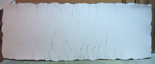
I received this very nice piece of Twinrocker (made in Indiana) paper as a Christmas present from Sandy Maudlin. It is 10.5" x 28" and I thought it would work beautifully for my redo of Trickle Down. I'm always drawn to odd shapes in paintings and I know, if this succeeds, it will be a bear to mat and frame. But what the heck, right? (Thank you, Sandy!)
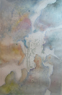
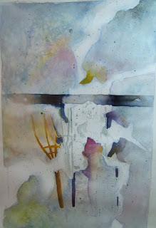
First, I lightly sketched what I wanted on the paper, looking at 2 photos of the pitcher plants. Then I misketed the shoots coming up from the bottom and some of the thin "stems" of the plants coming from the top.

First, I lightly sketched what I wanted on the paper, looking at 2 photos of the pitcher plants. Then I misketed the shoots coming up from the bottom and some of the thin "stems" of the plants coming from the top.

Next, I put a bit of pale yellow (also a new pigment I received from Sandy) on the flowers and then mixed up several colors (a bit of Prussian Blue, the yellow - Bismuth Yellow, and some Carbazole Violet), and painted where the background will be. (I had a mix of a raw sienna/goethite and a nameless blue - it has a name but I don't recall what color I put in the mix - and I used it here and there, too, which is where you see the warmer color.)
The Twinrocker has a deckle edge all around that is beautiful so I painted right to the edges. The paper (coldpress 140#, I think) really slurps up the paint so I got some blossoms here and there that worked well for the background.
So that's it for today. More to come tomorrow...
Purples + Other Colors
Well, we have some good mixes for purples from blogger friends:
Daniel Smith Colors =
Indanthrone Blue (PB 60) + Quinacridone Rose (PV 19)
French Ultramarine (PB 29) + Quinacridone Rose (PV 19)
and
Mauve by Rembrandt - which is a mix of PV 19 + PB 15 (Quinacridone Violet + Phthalo Blue)
Also Winsor Newton Colors =
Dioxazine Violet (a Cotman color) (PV 23) or Winsor Violet (PV 23)
Cotman is the student grade of Winsor Newton but I've heard people say that some student grade colors are as good as the artist grade.
My Carbazone Violet by Daniel Smith is listed as PV 23 (RS) so not the same as the pure PV 23 that the Winsor Violet but more towards red.
We also got a mix of Ultramarine Deep (Rembrandt? PB 29) and Alizarin Crimson Permanent (not sure of the brand- couldn't find them on the WN site or the DS site so maybe some other manufacturer).
Take some time and find your own favorites - just mix up what you have and play with the colors until you get one you fall in love with and then stick to it - write it down, keep tubes handy, etc. And don't forget, there are certain greens that look so good with violets/purples that it makes your mouth water. Like this photo of a girl in green and purple taken by a flickr member, janchan:
or how about this one by flickr member, patriciawillowcq:
Winsor Newton color (or should I say "colour"?) chart:
Daniel Smith color chart:
Rembrandt color chart: you'll have to check out the sites like Cheap Joe's and Dick Blick for a chart of these colors - they don't seem to have any homepage site themselves.
Monday, December 29, 2008
Purples and Other Colors
To check out the colors I use, go to
http://www.danielsmith.com/LEARN/default~art~watercolors.asp
and see some great combos and mixes.
And check out the Daniel Smith catalog online at
http://www.danielsmith.com/categories/paint/watercolor/ds/
to see all DS colors.
I tried to photograph and also scan the 4 violets I use but they came out too blue each time no matter what I set my white balance on. I couldn't match the color I get when I put the paint to paper.
I use Carbazole Violet (Semi-transparent and medium staining),
Cobalt Violet Deep and Ultramine Violet (both Transparent but granulating and low staining),
and I have Quinacridone Violet (which is more a reddish violet) and is transparent and very staining.
What's your favorite purple out of the tube - or what is your favorite mix of red and blue to get a good, clean purple?
Trickle Down - Out of Control

Well, Trickle Down got out of control and I tried to save it. There are some things that are appealing to me with this that I will use as I start over fresh. But this isn't worth saving, in my opinion.
I forgot my mantra: SLOWLY SLOWLY SLOWLY
Sunday, December 28, 2008
If You're in the Mood to Visit
Here are some artists who are doing some exciting, beautiful, color-licious art that I found from perusing my Watercolor Artist magazine again. Visit their sites and see some good stuff.
Go to http://www.harrisongalleries.com and check out Kiff Holland's light-filled paintings.
Go to http://www.bobrudd.com/default.asp and enjoy Bob Rudd's colors which are luscious, and unusual and, well, just purely delightful to see his paintings.
Do you know the difference between Visual Complements and Mixing Complements? Mixing Complements are those complements we all learn to mix to get a good grey or black:
red + green
yellow + violet
blue + orange.
But to work with Visual Complements, you create side-by-side pure colors that zing off the page (Carol Carter uses visual complements in her palette and so does Bob Rudd). Those colors are:
red + turquoise
blue + yellow
cyan + orange.
Now don't ask me exactly what color cyan is - I know my printer ink has one called cyan and it's a blue but maybe a bit on the green side??
Perhaps Bruce McEvoy's internet link, handprint.com has the answer? Or Hilary Page's book, Guide to Watercolor Paints? Or Nita Leland's newest book, Confident Color?
For a downloadable pdf about painting with pure colors, go to
http://www.artistsnetwork.com/article/wc-pure-colors and see what David Daniels does using a pure color palette.
Okay, now I either need to get some exercise or paint...
Enjoy!
Saturday, December 27, 2008
Trickle Down - a bit more

I wasn't happy with the edges on this one so have cropped them - literally - off the edges. I like it better now but still have a bit to do to get it to look finished (and, hopefully, not overworked). For some reason right now my painting seems like work, so I think I'll stop for a while and read or watch a movie or something...
The temperature outside today is - wait for it - 70F!!! Unbelievable.
Trickle Down

I did get some painting done yesterday and will work on this more this weekend. I made the salmon color from Rhodonite Genuine and a touch of Raw Sienna (both Daniel Smith paints). The small, slender shoots at the bottom are misketed right now.
Since we are having 60F weather today and dry, I'm going to go out and take a long walk to try to walk off some of the calories I accumulated this week!
Thursday, December 25, 2008
Christmas Sunrise
 This morning, the sun rose in the sky like a child's large golden-red ball. A gift to us all.
 Merry Christmas morning!

May there be, if just for this day, peace in the world; and may it begin in your town, in your home, in your heart.
Wednesday, December 24, 2008
Merry Christmas, Happy Holidays

From this little bit of scribbling and coloring frenzy I was in a while back, I then went to http://www.dumpr.net and created an ornament for all my blogger friends.

Merry Christmas, and may your days truly be "merry and bright."
Tuesday, December 23, 2008
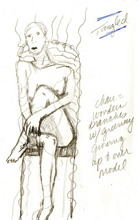
More Tangled + Trickle Down Begun

Misket off, painting more, shaping the woman and the rakes and the chairs. This may be something I work on for another week or more...seems to be going slowly and maybe that's because I'm not sure where it's going now. Have lost momentum but determined not to give up until it's really ruined!
So to give myself a break, I began the pitcher plants painting = Trickle Down. Misketed the whole area of the Great White Shape and then when that dried, I poured very diluted Hansa Yellow Light and water over it. When that dries, I'll decide if I want to pour another layer or just paint...have to create that salmon color with some yellows and pinks and...?


A Christmas Party with an Owl
We went to a lovely home in Villa Hills, KY last evening for a Christmas party with the raptor rehab folks. It was their end-of-year thank you party and there were about a dozen people there. The guest of honor was Kentucky, a horned owl. He sat on the back of a chair, calm as could be, just watching, turning his head around to view himself in the reflections in the windows, looking extremely bored :) When the group photo time came, Kentucky was placed on a rope stand that, unfortunately, was on top of a wood stove that was getting warmer, the longer he had to pose. He ended up flying (with his one broken wing) to the coffee table right on top of a lit candle - which snuffed immediately, thank goodness.

Nothing worse than a fire-singed owl for Christmas!

Photos by Jerry H. Carpenter
All I have to do today is wrap presents - so I'll have time to get back to my paintings later...
Monday, December 22, 2008
Tangled - More Painting

A bit more painting on "Tangled."
And the Great White Shape and misketed areas for the pitcher plant painting (I'm calling it "Trickle Down.") I did misket some outside the GWS, and I'm not going to paint it exactly like Tangled - I will either glaze the colors to keep them clean and fresh or maybe pour some of the first colors and misket off the whole GWS.

My Frog Prince
I am so proud of my Sweetie, Jerry, and the work he does with his photography for the Newport Aquarium. He just got an article in the Kentucky Enquirer - here's the link:
http://news.cincinnati.com/apps/pbcs.dll/section?Category=LIFE
Click on Aquarium at the top of the article if the article shifts.
It's in today's paper and, of course, we're going out to get one today as we do the last of our shopping. Like most of you, not much time for settling into painting lately with shopping, end-of-the-year appointments, and attending parties, etc. Maybe today I'll have something to add...(at least I'm not in the groups who are stranded in airports all over the US).
Sunday, December 21, 2008
Watercolor Artist Magazine

In the February 2009 issue of Watercolor Artist, they share the Best of Show winners from several regional and nationa shows. This painting is THE BEST PAINTING OF KOI I HAVE EVER SEEN! It blows me away. There are no pretty blues and green and lily pads mixed with the pretty oranges and whites of the koi. There are only animals striving towards the top of the water to get that food - and be the first one there. Just a fantastic painting! And the artist, Soon Y. Warren, does it all layer by layer, glazing until she reaches the place she wants the color to be. She won Best of Show at the National Watercolor Society show this year - and I can't imagine anything beating this. WOW!
If you want to see more paintings and articles from Watercolor Artist, go to http://www.watercolorartistmagazine.com
and check it out.
No painting today - went to a holiday party to visit friends that were in from Oregon (and, yes, we made fun of them because they have snow and we don't - but we just a bit of poking fun because we have bitterly cold and windy weather that feels like it's stripping the flesh off your bones). S., who was born and raised in Hawaii, was not loving this cold Kentucky weather, and was wondering if he and E. would get back to Oregon tomorrow without delays.
Saturday, December 20, 2008
Integrating the Great White Shape
Now we're painting! Integrating the GWS into the painting, leaving whites still, but getting rid of those we don't need. Thinking about color temperature and COI and shaping things.

While I was painting, I felt myself getting tight and tense and unsure where I was going - so I splattered paint - and I like it - it will fit in with the vines when I paint them in and around.
Jerry looked at it and said, "Well, I can't tell. How do you think it's going?" Tactful, eh? ha ha
I'm going to let this one cogitate a while because I felt myself wanting to rush. So I started something else to paint also using the GWS = a photo of pitcher plants taken in Florida.

Here's the photo, the tracing of the photo on wc paper (after I enlarged it), and the GWS for this one (which I may not trace onto the wc paper unless I use a very pale color because I don't want it to show).
Friday, December 19, 2008
Warms Around the Great White Shape
The cools didn't wash back to white very well - must have been staining or could have had something to do with the salt I put on? Oh, well.
I did what I could and then put a pale wash of warms around the Great White Shape (which is what I should have done the first time). So, if your dominant temperature for the painting is going to be cool, why paint around the GWS with warms? Because, later you are going to overlay those colors with cools and that will really grey them back and make them not important at the edges so your COI and area of interest will really be shown off.
When the area around the GWS dries, you locate where the darkest darks are going to be (outside of the GWS) and paint some of those in using your dominant color temperture and making sure some of the paint runs up against the GWS and even overlaps it in places. You are painting your darkest darks here. In a mix of colors in your dominant temperature.
When that dries, you "integrate" your shapes and grey your colors outside the GWS by layering a wash of colors on it in the dominant color temperature. So, I start painting around the GWS in opposite temps - where I see a warm green, I put down a cool red, where I see a warm yellow-brown, I put down a cool purple, and so on, leaving the whites where I want them but covering any areas I don't want white (like at the outside edges). I'll do that tomorrow.

I did what I could and then put a pale wash of warms around the Great White Shape (which is what I should have done the first time). So, if your dominant temperature for the painting is going to be cool, why paint around the GWS with warms? Because, later you are going to overlay those colors with cools and that will really grey them back and make them not important at the edges so your COI and area of interest will really be shown off.
When the area around the GWS dries, you locate where the darkest darks are going to be (outside of the GWS) and paint some of those in using your dominant color temperture and making sure some of the paint runs up against the GWS and even overlaps it in places. You are painting your darkest darks here. In a mix of colors in your dominant temperature.

When that dries, you "integrate" your shapes and grey your colors outside the GWS by layering a wash of colors on it in the dominant color temperature. So, I start painting around the GWS in opposite temps - where I see a warm green, I put down a cool red, where I see a warm yellow-brown, I put down a cool purple, and so on, leaving the whites where I want them but covering any areas I don't want white (like at the outside edges). I'll do that tomorrow.
Ooops!
Well, Sandy Maudlin told me I started incorrectly - I should have begun with a WARM pale wash around the Great White Shape = the opposite of the final temperature dominance not the opposite of the COI color. So, I'll wash it down and start over with a warm wash - after I return from the chiropractor's for some back-cracking :)
I will get this right - I've got too much time and effort invested in it now to just toss it aside or start over.
Hey, if you love Boston Terriers (and who doesn't?), go on over to this blog by Julie Zickefoose and check out the posts on Chet Baker's birthday - scroll down a few days from the current posts. He is sooooo handsome! And was so adorable when he was just a puppeh!! Makes me want one...someday.
Come back later to see the progress on the painting - after I change the wash to warms.
Thursday, December 18, 2008
And the Planning Continues...

Well, the next step was to create the "Great White Shape (GWS)" and make sure it works. Then, taking a watercolor pencil (so it blends off later), I drew the GWS on the watercolor paper over and around the things there. The GWS includes anything you want left white and anything you want to be pure color - so, of course, your Center of Interest (COI) is inside the GWS.
Next? Choose the temperature dominance of the painting. Done. It will be cool. And the body of the woman and some of the chair and rakes will be warm so they will be the COI.
Next? Misket any small area I want pure white and splatter some misket over the paper (to add texture).

Next? With a very light wash of color in a mix of cools, I need to paint around the GWS, blurring the lines here and there. Before that dries, I can do some things to create texture = misting water, pouring on salt in various sizes (popcorn salt, table salt, kosher salt, sea salt - did you know you can even use Epson salts?). I could even splatter more misket to prepare for the next layer, if I want. I used popcorn salt and table salt and large kosher salt on this.

Now it has to dry completely - bone dry before the next step.
Wednesday, December 17, 2008

Tuesday, December 16, 2008
Gallery Salveo
Yesterday, Jerry and I drove up to Norwood (Rookwood Commons) and saw the Gallery Salveo show. My watercolor artist friend, Marilyn Bishop had paintings and prints in the show and I wanted to see them. It is well worth the drive there! Just on Edwards Road off I-71, on the 5th floor - turn into the parking garage after the Rookwood Commons sign and take the elevator up. Lots of gorgeous artworks there. I really liked Marilyn's and 3 were my favorites: Morning Moon and Whisper I and Magnolia Mambo
I also fell in love with Mary Barr Rhodes' mixed media pieces titled Coppered Wetlands I and Copper Wetlands II. They were both sooo beautiful and serene and I got one of those "I wish I had painted that" feelings when I stood in front of them.
The photography of Bill Paul was Jerry's favorites and he had a lot of praise for his work. I liked everything he had in the show, too.
So, if you get a chance during this holiday rush, drive on over and see the show. It's worth your time and the space is big and open and wonderful to walk around and take your time viewing each piece.
Today = class to finish some pieces and our class party :) So do you think we'll really paint today? Maybe - also Sandy is going to do a demo for us while we eat and talk and eat and share presents and cards and eat and...well, you get the idea. Stay away, old snow and ice, until our party's over and we're all back safe and sound at home....
Sunday, December 14, 2008
More Stages of Planning...
Well, I'm wondering, with all this planning, if I will ever paint this! But I keep telling myself all this planning and working out things is a good thing. Yep, a good thing...don't worry, it will make it a better painting, don't give up, don't rush through...you can do this! I think I'm tired because right now I'm not convinced.
But I did work on it today and got to the Great White Shape stage....
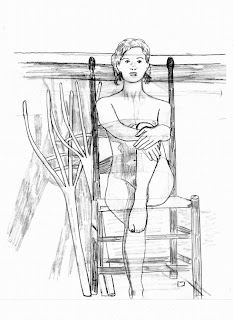
Larger tracings of the chair, the rakes, the woman. I made the woman in a reddish color because I traced her on the paper last and I wanted to see where her parts overlapped the chair parts.

Then I traced all that on the watercolor paper (140# Arches coldpress, 1/2 sheet).

Then I fiddled with the kudzu vine from photos I saw online (all in the public domain since they were a department of agriculture set made by agents in Georgia). I just have to place the vines and leaves around where I want them on the chair and woman and upwards above the dark railing.

And then I took another piece of tracing paper, laid it over the traced woman, chair and rakes, and tried creating a "Great White Shape," something Sandy Maudlin taught me after she learned it from John Salminen.

Sandy says a Great White Shape has to go off the page on at least 3 sides (mine goes off on 5); it has to have a diagonal thrust (check); and it has to be irregular/unpredictable in shape and size (check).
So, am I ready to paint?
Uh, no....
I next have to look at that Great White Shape again tomorrow (with fresh eyes) and make sure it's okay. Then I have to choose my dominant color temperature and what colors I want to use in the painting. Then I have to get that kudzu vine twinning around the woman and chair the way I want it - and onto the watercolor paper.
Then, and only then can I begin to put color to paper. So I'm looking at Wednesday...stay tuned unless you're so bored now you can't stand it - in which case, I'll share what I am planning on painting in class Tuesday (not this - something entirely different!)
Grandma Got Run Over By a...
granddaughter! ha ha Well, it sure feels that way. When you have an 8-yo (J.) and a 6-yo (A.) running around, somehow one thinks they are much younger and more limber than they are - especially when trying to scrunch into tiny places for Hide N Seek! ha ha
My old bones are telling me today how silly I was yesterday.
Oh, well, we had a great time and Jerry got some good photos for future portraits :)

Now off to my art room with a cup of coffee to energize me - and work on that painting to be - if I get more work done that looks interesting, I'll post it later...
Saturday, December 13, 2008
More Planning
This is what I worked on in the planning stages for the painting I'm going to paint soon.


Now, I can't promise I'll plan this much on every painting from now on but I'm going to try to plan more, paint less - especially in the intial stages. Afterall, I've gotten to the point in my painting where I don't want to just paint something - but I want to create something beautiful or interesting = step up to make art, not just paint for painting's sake.


Traced the chair and rakes and traced the woman in the sitting position separately and then just overlaid them and traced again, choosing what would go in front of what when edges overlapped.
And came up with this so far.
I also had to find some photos in the public domain that were of kudzu growing up things (which I'm going to use on the legs of the chair and over the woman in places).
Also, once I get the final drawing done on tracing paper, I am going to be a very good girl and create a "Great White Shape" for keeping whites and pure colors in the painting BEFORE I start painting. We'll see how much it helps the painting work in harmony and maintain some whites/pure colors, too. I have to enlarge everything since I want this to be on 1/2 sheet.
Now, I can't promise I'll plan this much on every painting from now on but I'm going to try to plan more, paint less - especially in the intial stages. Afterall, I've gotten to the point in my painting where I don't want to just paint something - but I want to create something beautiful or interesting = step up to make art, not just paint for painting's sake.
I may start the painting tomorrow, since we have the granddaughters today :) We picked them up and brought them here for the day so Mom and Dad can go shopping without them. Play Time!!!
Friday, December 12, 2008
More Quotes on Planning Your Work
From the latest Watercolor magazine:
"I'm very flattered when people tell me that my work looks as though it is done quickly. Actually, it is all very carefully planned out."
--- Nicholas Simmons (http://www.nicholassimmons.com)
They say you can't correct in watercolor, but you can. The first rule is not to make mistakes, so you need to spend some time visualizing the process before you put brush to paper."
--- Domenic DiStefano (84 and still painting and teaching and showing his work)
"Watercolor requires a great deal of planning..."
"Painting is 75 percent thinking and 25 percent putting brush to paper."
--- Nancy Gaucher-Thomas (http://www.gaucher-thomas.com)
Thursday, December 11, 2008
Planning
Reading the articles in my latest Watercolor magazine. There are always comments made by artists that really hit me and stay with me...not that I haven't heard these things before in class and from other artists but there is something about seeing them in a national magazine that gives them more power.
For example:
"For every hour I paint, I spend an hour or longer looking at the painting. Before I start, I preplan as much as possible and develop an extensive drawing."
--- John Salminen (http://www.johnsalminen.com/)
"You have to know what you aim to do and figure it all out in advance. You can't change your mind in the middle of a picture. Putting your ideas together into conceivable compositions can be the difficult and frustrating part."
--- Paul Rickert (http://www.paulrickertart.com/)
So today I'm planning using these elements that may end up in the final painting - they may not!


Photos taken by me from Shaker Village in Kentucky
A quick sketch of something I was thinking about at the time in my Exacompta sketchbook.
I'll use my Virtual Pose 3 cd images to get the body and position of the woman in the chair.
Wednesday, December 10, 2008
Playing with Sketches


I had some things sketched in my Exacompta sketch book, and I just played around with them with brush pens, ink, etc. Sometimes it's fun to just play.


Tuesday, December 9, 2008
Finished and Started in Class

In class today, I finished this painting of Teddy, my friend Susan M's TeddyBear of a chocolate lab :) He's a pretty relaxed dog.
I had fun playing the warm colors against the cools.
And I also started and got this far on a portrait of my sister. It's her birthday today!!! HAPPY BIRTHDAY, Li'l Sis!!!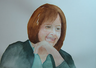

Normally, I would have a lot more colors in this but I'm thinking about giving it to her and she probably wouldn't like it as well with lots more color.
Monday, December 8, 2008
Rohatsu/Bodhi Day

Today, December 8th is the start of Rohatsu (called Bodhi Day on my Tibetan Calendar), the day Siddhartha, after much study and meditation, became the Buddha, the Enlightened One. Here is an article from Beliefnet.com about Rohatsu and what it means.
http://www.beliefnet.com/Faiths/Buddhism/2004/12/Keep-Your-Eyes-On-The-Moment.aspx?source=NEWSLETTER
This "keeping both eyes on the prize" type of living also applies to our art. If you are looking for that first-second-third prize in any competition/juried show, then are you painting for you, or for the juror(s)? This is something I will have to ponder and decide for myself, since I'd like to enter more juried shows in my area in 2009. That's just for me and I don't think it's ego that's leading me that way - but doesn't ego lead us into lots of things we think are okay until we get there? ha ha
So...time to meditate and appreciate the here and now - it's a Zen thing...
I hope you are all safe (it's sleeting here and the roads will be like a skating rink), and warm (the temperatures have turned frigid and I'm glad there is no wind today), and most of all, content with who you are and where you are in this world today, right now.
Saturday, December 6, 2008
Watercolor Magazine + Nicholas Simmons

My Winter 2009 issue of Watercolor magazine was delivered this afternoon. I poured over each painting, and then read one article through and through - the one about Nicolas Simmons and his watermedia techniques and paintings (talk about Eye Candy - and I mean the paintings! ha ha).
If you don't have a subscription, get a copy at your local newsagent/bookstore because it's full of wonderful artists that are bending if not downright breaking the rules of traditional, typical watercolor. Check it out! And go on over to Nick's blog (http://nicholassimmons.blogspot.com/) and see more work and read more words about art, music, life, etc.

What made this current issue so interesting and timely to me: I also got my latest issue of The Artist's Magazine. Inside, a watercolor painting instructor at the American Academy of Art in Chicago, IL bemoaned the lack of any images being painted in watercolor that were more than "interchangeable collections of beautifully crafted images" and that many talented watercolor artists are "only interested in creating images for decoration."
Well, maybe he should open the current Watercolor magazine and view works inside by:
John Salminen, Paul Rickert, Dominic DiStefano, and Nicholas Simmons.
I don't think any of these artists are just creating pretty, decorative pieces of art to hang above your sofa. They are some truly kick-ass painters, whether they pick up a brush filled with watercolor paint, acrylic, fluid acrylics, or mud from their back yard!
TriState Photographic Society Show

For those of you in the local KY-OH-IN area who like good photography, come by and see the latest TriState Photography Society show. It actually began during First Friday last night (not sure how many braved the frigid temperatures to do the walk around the galleries last night) but the actual Artist Reception will be Sunday, Dec. 7th from 1-4 pm.
Come by and see the work of many of the TSP photographers and their works. It is located at the Covington (KY) Artisan Enterprise Center, 25 West Seventh Street and the show runs through the month of December only.
Although Jerry didn't put any of his photos in this show, we will be there Sunday afternoon to support the other photographers there and see some interesting work - so we may see you there!
Subscribe to:
Posts (Atom)