Friday, April 30, 2010

I WON SOMETHING!


I'm going to have to stop saying, "I never win anything," because I just won a book from a giveaway over at Katharine Cartwright's blog!
It's by Wendy Richmond, and she even signed the copies she so graciously gave away! How cool is that?
Katharine has been studying and sharing various books about art and this was one of the recent books. I thought I was too late to answer the question and win - but I tried - and was the 2nd one in with the correct answer.
(For the question and answer, you'll have to pop over to Katharine's blog!) Thanks so much, Wendy, for your generosity. And thanks, Kathy, for making this happen. I'll be reading this one soon.


Thursday, April 29, 2010

A FEW PHOTOS


Here are just a few photos from my Shaker Village trip. The shakers are known for their simple furniture and their notched wooden baskets. They grew broom corn and made their own brooms (sheafs of broom corn in the window).


The Shakers were self-sustaining with farmland, orchards, and livestock on their property. I think my favorite thing this time was seeing the new lambs and kids.

They start shearing the sheep on Saturday, May 1st and continue through the month. I may have to return to see that - and the dying of the wool with all natural materials.


Sometimes the best part of the photos is the light that slants through a window...
Any of these would make nice paintings...ah, so much to paint, so little time!


HAVE I BEEN MISSING?

Deb Ward, Sharon Roeder (another local artist), and I all took a girl's trip down to Shaker Village in Kentucky. We left Tuesday morning, spent the whole day walking and talking and taking photos and stopping for meals and more talking, staying up late talking and watching the moon rise over the stone fences and white fences of Shaker Village from our "suite" above the Sister's Shop (that's where the ladies give weaving and spinning demonstrations during the day but we had the whole place to ourselves that night - which was a good thing because we laughed and talked a bit loudly at times). It was a great trip and I really enjoyed myself.

You've seen Shaker Village photos I've taken in the past, of course, but I'll have some new photos to share once I catch up, get them uploaded and sized for posting.

Glad to be home but Shaker Village is such a wonderful place to visit. There were so few people there that when you stood quietly and just listened, the only thing you heard was birdsong and the breeze blowing the tree leaves around. The first day was a bit rainy and damp and cool but the second day was warm, sunny, and we had to take more photos before heading home.

Thanks, Deb! Thanks, Sharon! For being such good traveling buddies and making me laugh so much I think I've dropped 3 years (since laughter is the best medicine, I've surely gotten younger since this get-away - at least, I'm telling my legs that it's true! ha ha)

Monday, April 26, 2010

DEB WARD WORKSHOP - DAY 2

I was too tired last evening to post anything. I took my camera the second day but only got one good photo before my battery died and I didn't have an extra set with me. So had to buy batteries on the way home and take a photo of what I had completed in the workshop both days.

Yesterday, I took the "scenic route" to Deb's, traveling more on Route 1 and seeing the houses, farms, redbuds blooming, dogwoods coming out white against the green of the trees. Saw a huge, healthy hawk sitting on a fencepost so close to the road I could see the individual feathers on his chest! Good thing the speed limit was 45 because I just took my time and enjoyed the drive. The sun peeked out from the clouds once in a while but it was drizzling again by the time I got to Deb's (and I'd wanted to take a photo of the sheep and goats at the farm before turning onto Deb's road).

Anyway, the day began with us picking up our watercolor boards that were prepared and drying. (The evening before we left Saturday, Deb passed around white gesso and had us take our fingers and dab gesso on the edges where the paper has a tendency to pull away from the board. She said this will keep that from happening if you paint really wet-in-wet on it. I'd always taped the edges before but this worked and I'll continue to do it.)


I hadn't chosen a photo to use or done a drawing so spent an hour that morning doing that, getting my drawing on - I didn't do freehand because of the intricacy of the flower so traced on tracing paper and then put Saral graphite paper behind the tracing and traced that onto the watercolor board. Then I rubbed a kneaded eraser over the paper, lightening the Saral which tends to be too dark for me.


So I was ready to go and worked less wet this time, pre-wetting just the areas I wanted to drop paint into, so worked bit by bit and tried to get some good variety in the greens of the leaves. I worked paler than I normally do, too, just taking my time with the colors and values.


The painting was from a photo taken at the St. Louis Missouri garden my Sweetie and I toured (last year?) during that horrible 102F heatwave - I think it was in June. Walking through the Asian-inspired areas, you came upon this huge pond and the number of lotus flowers blooming in this huge pond was overwhelming - one of the most beautiful things I've seen.

I finally got to a point where I couldn't stand the white background any longer, so wet it all around and dropped in Ultramarine Blue (which exploded in the water like blue fireworks) and Hansa Yellow and toned it a bit here and there with Raw Sienna. Then I went back and darkened and shaped some of the leaves and a touch here and there (with Titanium White - yes, you can use white in acrylics!) on the tips of the petals.


Here's a close-up of this one...


When I'd get to a point where I wanted to walk away from this one, I'd go back to the heart lock painting and I tried to tackle that wooden background that had to be drybrushed. I used just Hansa Yellow Light, Quinacridone Gold and Ultramarine Blue for the wood, and tried to do it with a bristle brush, keeping things dry (except for that right top which got a bit green and wet).


I still have work to do on this one (push some things behind other things with the rusty bits, maybe darken some of that blue of the metal, work on the whites I still have, and do a tad more on the drybrush background that is supposed to be wood - it needs the lines running down that are the separations of the boards).

I consider the lotus blossom finished.

I was putting things away and realized I had another 1/2 hour or so...so got out a fresh piece of watercolor paper (140# Fabriano, I think), and took a stencil I'd bought from Mary Beth Shaw (she's making them now and selling them), and just took the left-over paints on my plates and used that to create this - fun!
Everyone said they already saw a garden in this. I'm not sure what I'll do with it - it's pretty just as it is, but it could become something else. I'll let it sit and just enjoy it for a while. The stencils Mary Beth sells are a good size (this was just laid down on an 1/8 sheet and it's almost like a print with the white edges showing).

I only got one photo of what Deb was working on. She began by misketing areas and then going in with a grey and doing her underpainting of her shadows but she was so busy with a couple of the students that she didn't get much time to paint. I hope she does more and shares it on her blog.

Saturday, April 24, 2010

DEB WARD WORKSHOP - DAY 1

Day one began with a long drive to Deb's, enjoying the countryside (passing the long wooden fences and the sheep with lambs all wet and wooly from the drizzly rain, seeing the bright yellow of the mustard growing in a patch of garden and then Deb's pond coming up on the left and her house). Got there just before it really began raining harder. Started with Deb talking about fluid acrylics and how they can be thinned and painted with just like watercolors. The only difference = once they are dry, they are set and you can't move them without using alcohol and you don't want to do that on good watercolor paper.


I started with 300# Arches and didn't know what I wanted to paint so took a lot of photos with me. Began by drawing this one the paper and starting, like Deb, with a pale wash of colors as an underlayer that will shine through.

I worked on mine after Deb did her painting, talking about how she was using the paints and why. She glazes a lot so starts very pale - which is why I was starting out so light (normally I go in too dark too soon and didn't want to do that).


Deb paints memories. She likes old things - her grandmother's quilts, old china and silver and has done many paintings of lace and fruit and quilts and old-fashioned roses. This was no exception as she was doing a painting of her grandmother's quilt with 3 roses on top. She's done this painting several times (yep, she works in a series), and was changing the color of the roses in this one a bit.


We had a good-sized class watching and listening and taking notes as Deb discussed her process and how to get the best out of the fluid acrylics, letting them blend on the paper, pre-wetting the paper, etc.

I waited until Deb had done her second stage before going into mine again (had to have a coffee break and a sweet, chat with some of the other students, and watch Mike move the cows to the next pasture - just over the pond, we had a front-row seat to how he does it and how docile those cows are, knowing where the grass is greener and going there). Deb's husband, Mike, said if he heard too much giggling he'd know it wasn't a class but just a party! I think it was a bit of both :)


Deb went in over the underlayer of pale colors and darkened and shaped a bit more of the quilt and flowers, putting lots of pinks and reds (Quinacridone Rose and Alizarin Crimson - both Da Vinci fluid acrylics) in the blossoms and the leaves and stems.

When she stopped, I began on my next layers. As you can see, I was dying to get darker - and did, trying to let the colors blend and working with a very limited palette of Cerulean Blue, Ultramarine Blue, Quinacridone Gold, Hansa Yellow Light, Raw Sienna (all Da Vinci fluid acrylics). She reminded me to do the Nick Simmons technique on this to get more texture = wait until the shine is off the paper so you know the paint has begun to dry and then take a strong spray bottle and really spray across the color, lifting some of it back and created his "batik" look. I had waited too long for the right side because nothing lifted but I did get some lift on the upper left side.


This is from a photo taken by my Sweetie of an old lock in Scotland - I think it was on a castle door, but am not sure.

I continued to next stage after Deb did her next stage, and began putting in some of the darker shadow shapes on mine while Deb worked on her quilt stitches (a lot of little detail to do).


This is where Deb stopped for the day, around 4 pm. She had shown us how to shape the rose and leaves, how to do the underpainting so it shows through and how to do some shadowing. Several students had a completed painting - although small - when the day was done. Many were almost done. I, however, had a ton of drybrush (all that background is wood) to do as the background on the painting I did...and was not looking forward to it!
But I'll take it back with me tomorrow and Deb will help me do that without overworking it (I hope)...but I'll need a lot of coffee and sweet breaks! And, of course, we'll start another painting on watercolor board!

Deb's offering this 2-day workshop again May 1-2, so if you're in the area and are interested, check out her blog and give her a call or send her an email. You don't have to have ever put a brush in your hand - we have one student who has never painted before (not in watercolor, not in acrylics, not in anything), and she was doing very well as she copied the same painting Deb was working on.

WEEKEND WORKSHOP WITH DEB WARD

I'm signed up for a weekend workshop with Deb Ward. Saturday and Sunday - both days start at 10 am and end around 4 pm - I'll be learning more about fluid acrylics and doing two paintings - one on 300# watercolor paper and one on watercolor board. I'm looking forward to it and will try to remember to take my camera for photos to post here when I've decompressed (probably not until Sunday evening).

I haven't used my fluid acrylics, only doing 2 paintings with them (one in Sandy's class using her photo/composition), and this will get me ready for the Nick Simmons workshop I'm signed up for in August (hosted by Sandy Maudlin). I only have a few colors and ordered more but not sure they'll get here in time (they didn't come in time since they didn't arrive by UPS by Friday evening). Oh, well. I should be able to make my colors from what I have right now (ordered after watching Nick's DVD and checking out the colors he used then).

Friday, April 23, 2010

IT AIN'T EASY BEING REID!

I'm still trying to conquer that very wet-in-wet and juicy style Charles Reid has mastered. It ain't easy!

I haven't started cussing yet but I'm getting close, especially with this set-up where it's supposed to be very dark behind the objects but bleed the shadow shapes into the background on the left (shadow) side. Hard to control all that water and I'm getting the values too light. It's all about paint to water ratio and how you can (or can't) control it.


My first two efforts are pitiful. Lots of bleeding and blossoms and I only got the background dark in the 2nd try (bottom) by using Prussian Blue instead of Cobalt and once it's dried, it's on there (no lifting or blending).
I'm blending the background too much - no variety in the colors (I'm trying to stick to 4 colors - a red, a blue, a yellow and a green for the lime if the original 3 colors can't make a good green).

Traded the Prussian for Cobalt Blue instead so no staining but some granulation - which is okay. Too much separation of colors in the background on this one.


And finally began again with Cobalt Blue, Quinacridone Rose and Yellow Ochre and a bit of Sap Green for the lime.
This painting is fresher but the background is no where near as dark as it needs to be. I could go back in the background only and play with that (he did that on the DVD, going back to darken and drop in colors over and over), but I think I'll leave it at this. The splatters were done out of pure frustration at the end when I realized that the background was drying too light. If I'm going to leave it this way (and I think I will), I should go in with some touches of darks in the pot and lime to tie the darks together more.
Now I'm going to watch this part of the DVD again and carefully think about what he's doing that I'm not doing. These "assignments" are just going to get more detailed and complicated as the DVDs go on so I'd better get this before moving on to the next painting. (I do like the pencil and the lime in this one but that little pot drives me crazy.)

Wednesday, April 21, 2010

LITTLE LONG WAVE

I finished this one yesterday and it's not too bad. A small one on a piece of leftover (long and narrow) Arches coldpress 140# paper.


It's odd but when I work on these waves I go back to my synthetic brushes and when I do the Charles Reid practices, I pick up my sable brushes. I think I should retrain myself to use the sables but I forget not to mix and pull paint out of the wells with them (and they are too expensive not to put them down and use a mixing brush instead).

I'm enjoying doing both things at the same time - while waiting for one to dry, I pick up another and start or finish it.

My Sweetie says it looks better with the top cropped off because his eye keeps going there and way from the waves. I think he's right - because I didn't make a good separation between the sky and back waves (can't seem to get them right yet). So with the top cropped down, the top now could be back waves/water or it could be sky.


Tuesday, April 20, 2010

GREENS AND GREENS AGAIN


I wasn't content with my two prior efforts, so gave this another try.

I began by working up some greens from my colors so I could see which ones I wanted to try. I would have liked to go even darker (needed to add more Prussian Blue) to the bottle but I'm not too unhappy with this one. Even did the background. My apple looks a bit mushed on the bottom but not too bad. Limes are hard - a dark color but some dimpling, too...I may have to pick one up at the grocery to have a real subject.

This one's closer to what I wanted so I think I'll move on to the next painting - a little white container, a lime (again, that dreaded lime!), and a pencil against a dark background...


Again, start with a contour drawing from the inside out - not just a silhouette. And what I got from watching him paint this is:

Draw your shadow shapes, connect your objects by overlapping or with shadows. The light is coming from the upper right so this side will have harder edges; the shadow side is the left side so this will have softer, blended edges.

He used only 3 colors (although he wasn't happy with the color of the lime when he finished) to teach more about edges and shapes than getting too into colors right now. He really hated that lime, though, when he was done :)

And what a mess the background looked as he worked it! Running, blossoms, yucky stuff going on...until it was finished and then looked fine. And he did wipe his brush onto his apron (or his sweatshirt), and he dabbed a run that wouldn't stop flowing down from the background to the lime several times (although he tells us NOT to do that EVER).


More to come as I try this one next - think I can get it in three tries?

Again, I'm just on the second DVD and am slowly working my way through the three DVDs in the set - and I do recommend them if you want to loosen up, see things a bit differently, etc. But you won't paint like Charles Reid at the end - who would want to? You want to paint like you, no matter who you study!

Monday, April 19, 2010

PRACTICING GREEN SHAPES

Well, I shouldn't even show you this one but I will. Why? You can learn from my mistakes! And when I "finished" this one (oh, yes, it was completely finished!!!), I wrote at the bottom of the paper what I didn't do right, including going back in again and again trying to "fix" the color with...what...water! A no-no, according to Mr. Reid and from this pitiful example, I'd say he's right. So I guess I just stopped thinking on this one - something I tend to do at times and the outcome is always a bad, muddy painting like this one. Is there anything I like about this one? Well...I like that I did get a good dark color in the bottle and the light grey background is nice. So...on to the next one - try, try again.


I realized while watching his DVD again this morning, that I was shaping the shadows beside the objects instead of just underneath them (like he did). I'm not painting along with him but watching a section/assignment and then doing it later so forgot some areas and how he made them look.


So...what is wrong with the second one? Those "shadows" that are horrid and not the right shape or color, the timid green look of the lime (was afraid of making it look like the first try so was timid on this one).

Do I like anything? Yes. I like the green of the apple and the light shapes in it, and the nice blue-green color of the bottle.

I stopped before doing the background but you can see how it's supposed to look here, with CR's exercise...


He didn't like how blue he made the lime but "had to stop" at that point. Knowing when to stop, even when you're not happy with something, is such a huge part of watercolor painting. I like the colors of my bottle more than the colors in his (and he did go in over and over with colors in it - but only when it was still wet and juicy).
He created negative shapes beside/behind the white labels of the bottle that were nice, and his shadows were just a line of color underneath the object while it was still very wet so it bled a bit. His signature style, of course, is letting the drawing show, as he did with the shadow shapes he drew and didn't even try to fill in. He's not filling in shapes but letting things happen as he paints...allowing for happy accidents and changes as he goes along. Me, I kind of like that blue lime :)
No overlapping shapes on this one but another to come that does overlap more. Again, the focus is on contour drawing and then contour "painting" by working from the inside out and moving in and out of an object; blending colors to get what you want but blending them on the paper while the paper and pigment are good and wet; making connections between the objects on your paper using shadow shapes, backgrounds, etc.

Saturday, April 17, 2010

ANOTHER FINISHED WAVE + ONE

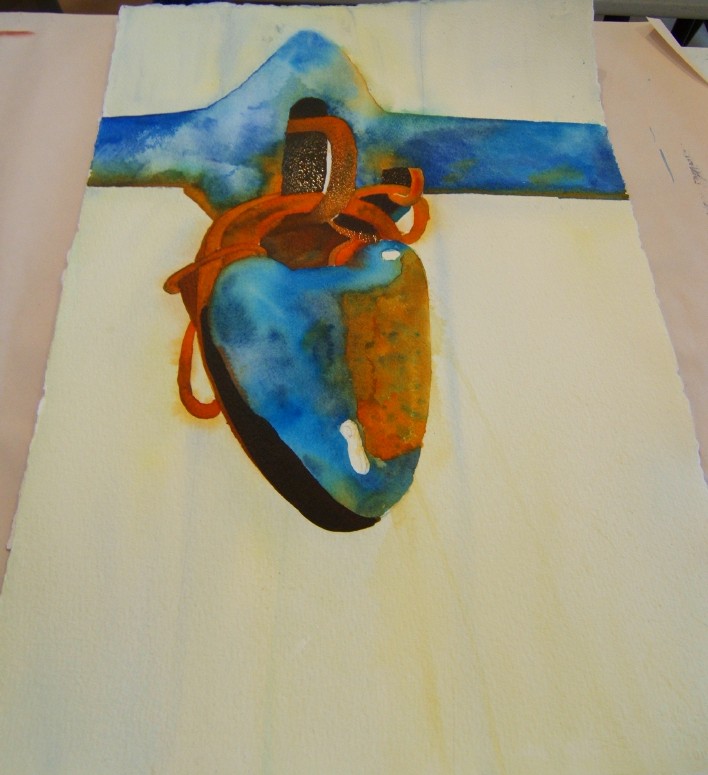
I finished this wave painting today. Now that it's up, I see some small things I can change and tweak. Not too unhappy with it...but have to admit I used a bit of Chinese White in areas where I lost some things and wanted to blend a bit more and tone down things. Not cheating...just using the tools you have :) This was from a photo that looked more gray but I'm going to give my sister a choice of these two and she liked the greens so I stayed with that.

This is a view of Matanzas Inlet coming on high tide from the deck of our rental. That bit of beach is now protected but last year people drove all over there. Now you can walk it but no vehicles. Apparently, they want to protect it for the birds and possible turtles - and I was told that someone was run over and that really put a stop to it (guess the driver didn't see the person laying in the sand??)


With the next try, I'm going to go more blues and violets and see how that goes. This is on a long scrap of Arches.


I watched more of the Charles Reid DVDs yesterday evening while Jerry was having a photography club meeting here. So now I have a "real" painting of 2 pieces of fruit and a bottle (all in varying shades of green because he says green is the color most artists dread/avoid). I've already done plenty of color studies so won't do that assignment, but will try the painting using a lime, an apple and a dark green bottle. He worked on sharing how he does contour drawing, too. Putting your pencil to the paper, you begin working inside the object (not creating a silhouette of the thing), cutting in and out, trying to keep the pencil connected to the paper at all times.

He talks a lot about having areas of connection = shadows connecting to shadows and to objects, overlapping objects, etc. And he talks about having areas of isolation = objects standing alone with a hard edge against a white background. Drawing the way he does gives you more practice in keeping the connection of paper and pencil (and later, paper and brush). If you've seen him draw, you know he isn't concerned about complete accuracy in form but more in lights and shadows and "connections" and "isolations" of objects in the painting.

Some words of wisdom from Charles Reid:

Watercolor is a work in progress. What you see when you put it down is not what you're going to get.

Work wet-in-wet immediately. Don't wait or you'll get "balloons." (Balloons = blossoms or backruns)

Sometimes you just have to Stay Your Hand. (I know. But how do you do this?? I put that in caps - why? Because if I could just learn this, I'd become a better painter.)

The more you mix on the palette, the worse it gets.

Watercolor is filled with happy and unhappy accidents.

Did you know that he uses two of the dreaded no-no pigments? Yep. He touches up whites with what he called opaque white (I assume he means gouache). And he uses Ivory Black!! Horror of horrors!!!

His favorite mix for grey = Yellow Ochre, Carmine, Cerulean Blue. He doesn't pay any attention to whether a pigment is transparent or opaque.

I'm enjoying watching this, bit by bit, and trying some of the assignments. I would recommend it so far. Still on the 2nd DVD and have more to go. I'll share my lime, apple and bottle painting when I do it.

Friday, April 16, 2010

JUST A LITTLE PRACTICE

Assignments from the Charles Reid DVD number 1 are to create a lot of swatches and do some fruit studies (with just 2 colors on each piece and not worrying about anything but learning how to swivel and swirl that brush the way he does = not as easy as it looks). I used Fabriano Artistico watercolor 140# paper and a Kolinsky sable (from Escoda) brush I never use - it feels mushy to me after years of using synthetics but I'll get used to it.

These look sooo childish and I need a good apple red color - any suggestions?


This and the next wave painting are the only things I've done this week so...here are my swatches, my lemons, apples and oranges. Each time you study something, you learn something, even if it's not what was in the "lesson plan." Today I learned that I really like the greyed blue of cobalt blue plus just a dab of raw sienna. I also learned that it's hard not to lose contact with the paper, pulling up your brush and going back in to dab or stripe or whatever. I guess this is about learning how to maintain contact - brush to paper at all times; and about how to NOT go back in after you add the second color (as the shadow color) even if you really really feel the need to do so!
Cobalt blue pure or greyed with Raw sienna for the shadow line (which is all he required for these studies and even that is heard not to futz with).

I also began another wave painting, using my own photos taken at the Matanzas Inlet earlier this month. I know it looks a mess right now but I have faith that I can make it work...yeah, that's what I'm telling myself right now!

Thursday, April 15, 2010

CHARLES REID DVD

I received this in the mail last week and am now going through the 3 DVDs included in the set. It's hundreds of dollars less than travelling to a workshop with the man, since he is the most expensive workshop instructor around (I think), and always has waiting lists for anywhere he goes. Apparently, everyone wants to paint like Charles Reid.


Some info from the first DVD:

He prefers and uses Fabriano watercolor paper.

He paints with his paper upright on a easel (probably because he began as an oil painter and learned that way), sitting in a chair. He doesn't recommend starting this way for beginners, though...just paint flat or at a slight tilt.


He uses a small, metal palette (almost a travel palette and he hates plastic palettes so always has metal ones) he holds in his left hand while he paints because he doesn't like to have everything spread out and have to reach for it.


He paints very juicy with lots of pigment (either Winsor Newton or Holbein paints), and almost always paints and blends his colors wet-in-wet.

So, as I'm in between other things, I've been watching the first DVD. There are lessons and then assignments he wants you to do = swatches and some fruit studies to learn his technique. I think it has to do with the water to paint ratio and the way he moves his brush. No dab-dab-dabbing the color on but contacting brush to paper and leaving that connection as he swirls the brush around, angling the handle in the direction he wants the stroke to go. He, apparently, doesn't use anything but Kolinsky sable rounds, which are pretty pricey (but not if you're Charles Reid :)

I think I'll do the assignments, just for fun and to see if it helps me with my brush control more. I have a couple of sable brushes I never use - so will get them out. And I do like Fabriano paper a lot.

If you're interested in this DVD, I ordered mine through http://www.paintflix.com and it was delivered quickly.

Wednesday, April 14, 2010

FINISHED GREEN WAVES


This is where I left it last time (left view).


This (below) is the finished piece.


I got a bit too heavy on the greens but you can make waves and water any color and I have plenty of photos for my own paintings now. (Plus, it's not really THAT green but the camera is picking up all the greens more than the blues in the painting.) This one is going to my sister as a thank you for lending me her laptop.
I'll do this again because once you learn how, you can just create any composition you want because waves can do all kinds of patterns and rolls.
Plus, I found one of my books I purchased years ago on painting the sea and shore by E. John Robinson that is good to use while you're learning. He goes into detail about the shapes and aspects of waves and whitecaps and foam and...
I carried a copy with me to the Bahamas once years ago...and left it in the hotel on the desk when we left. So bought another copy. I didn't realize it was so pricey now - I guess since it's a hardback copy. I just looked at my receipt and see that I got the second copy for free back when I was scooping up rewards points from NorthLight Bookclub, back when I had to have every book - which was going to teach me how to paint. Now I don't often watercolor books and am more into DVDs.

Tuesday, April 13, 2010

A BETTER COPY + WAVES PRACTICE


Took this one outside into the sunroom and got a more accurate picture as far as the colors go...but still not a good painting. So still a do-over with another idea about that moss and how to paint it.


Instead of worrying over this one, I watched the waves DVD again and painted along, stopping to let the paint dry as needed. I was a bit timid about the color at first so it was pretty pale when I began.


Not finished yet - but I'll get it done today and maybe start on another one...or another crow...whichever calls to me at the time.

This is on a 10" x 14" block of Arches coldpress paper.

Monday, April 12, 2010

PROBABLY A DO-OVER


I had the Naples Yellow over the "stringies" of the Spanish Moss, intending to cut into that with colors. Couldn't think of the colors to use but knew I'd have to do opaques. So picked up some more Naples Yellow, Chinese White, Periwinkle (a violet by American Journey), and Zoesite Genuine (I think that's how it's spelled but it doesn't look right) for a variety in which to dip my brush.

It seemed to work
and yet
it didn't.


I think it's a do-over...

Everything is too muddy for me. So either I start again with a better idea or use some fluid acrylics on it or...
just call it a bad painting and move on to something else...like waves or another sunny scene.

The photo isn't showing the warmer color at all - not sure why. Maybe I need to take another photo in the sunroom in shadow and see if it's more true to the painting colors...

Sunday, April 11, 2010

TSP PHOTO SHOW + LANDSCAPE PLAYING

The TriState Photographic Society artist reception was today from 1 - 4 pm and went well with close to 100 people coming through to view the exhibit, have a cookie or other snack and talk with the photographers. There were some new members' work I'd never seen before so it was fun to see new stuff. I'm not a member - or a photographer - but I go to support my sweetie, Jerry, who is my favorite photographer.

The show runs at the Sharon Woods Visitor Centre (a very nice venue) through Sunday, April 18th so go over and check it out if you have the time and are in the area.

And here is a silly little landscape I played with by:

Putting the watercolor paint on a large piece of plexiglass
Spritzing my paper
Laying the paper - wet side down - on the plexiglass
Picking it up and seeing what it looked like.


I've seen things like this done (in art magazines) but never tried it and thought I'd play with it. I did see a landscape but can't seem to bring it to a finish for some reason.
I can see the water and beachy area and the tree at the edge and the tree/shrub line but...not sure about the background. Mountains? Clouds?
Oh, well, it was just a play time so not seriously worried about this one and have been working a bit on the Spanish Moss so will have something to share there soon...unless I ruin in which is possible if I don't take the time to see it clearly before putting that brush to paper!

Friday, April 9, 2010

BY THE SEA...


for whatever we lose
(like a you or a me),
it's always ourselves
we find in the sea.

--- e. e. cummings


Just a few Florida vacation snaps...