I think we only have two more weeks of lessons in the Val Webb online course, Painting Birds in Watercolor and Beyond. In this one, we pulled out the watercolor board again - I worked on the 8 x 10 inch piece as is, although Val cut her paper or board down to 6 x 6 inches. First, the blue skies. Painted the blue around, then lifted with a natural sponge (Val used a cellulose kitchen sponge but I have some natural sponges so used them).
Next we will put a bird up in that sky to see how she soars.
Can you believe it's September tomorrow?
The best thing to do when painting on Yupo is to let the paint do its thing and don't try to say everything.
Well, that went out the window when I was playing with this piece.
Now I need to return, blur, soften, take out, etc. - again, thinking about how George James would do it (he definitely wouldn't have worked SO LONG on creating her face - he would have just left it so you could fill in the features).
I made the mistake (?) of putting in black India ink in places and it does not lift off - maybe I'll try some alcohol on it and see if that will lift it. And that green is painfully green :( Of course, that's the beauty (?) of Yupo - I can wipe a lot off and start over fresh and maybe add in some china markers (grease pencils) and things to make more marks...too many decisions!
So, after some looking and thinking and wiping back...here is where she stands. Better?
Not done yet...we'll see where this one goes.
Autumn is almost here - where did the summer go? (And why is it so hot and humid now?!?)
Got an email from a stranger asking me if I'd mail paintings internationally (although he didn't say where he was located), and when I said he could pay by PayPal, he gave me reasons why he couldn't. Think this is a scam? Yep, I do!! Beware when there is not enough information on the requestors side to tell you who they are or where they are or how they are going to pay for artwork (which was never mentioned by name).
Picked up my two paintings from the GCWS Show at the Barn yesterday morning. Six paintings sold, but mine were not among the happy few.
Wasn't that something they used to say in the old Monty Python's Flying Circus programs?
I have been anti-Yupo for a while, after hearing stories about it from others about problems with it. I also removed a painting from a mat and frame and it was yellow all around the outside so it didn't retain it's white color after just 2-3 years in the frame. It's funny, too, because when I was first introduced to this, I loved the way the watercolor flowed and dried and created interesting shapes on the plastic Yupo.
So I decided to get out a piece I'd painted on, wipe it all down and try something on it again, just to get the feel of it. So here's a start of a watercolor painting on Yupo.
Guess I'll take a cue from George James (the King of Yupo) and make some big changes as I go along, blurring lines, making marks, etc. He sticks to just watercolor on the Yupo while I've found most artists around here paint liquid acrylic on first and then add watercolor after, doing some wiping back of the acrylic with alcohol or a Mr. Clean Eraser (which is what I used to wipe off the painting that was on this piece before I began a new one).
There are many artists using Yupo for watercolor, acrylic, fluid acrylic, even oil and china markers. So I guess anything goes if you want to try out this plastic to play on. We'll see where this play takes my painting...
In Val Webb's online course, Painting Birds in Watercolor and Beyond, she had a materials list that included a set of three watercolor boards (8 x 10 inches). I used one for the gouache and ink technique and used this one for the toned paper painting. You tone the paper first, then draw your bird on and lift and add color and gouache and whatever you want to get the coloring.
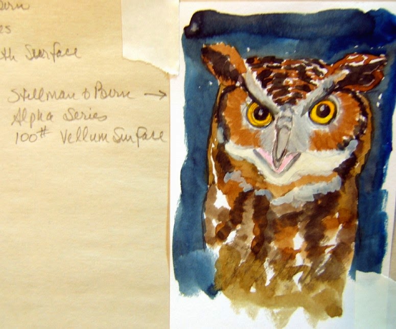
This great horned owl, named Kentucky, is one of the raptors Sweetie takes care of when he volunteers at the raptor center here locally. They have the great horned owl, a barred own, a screech owl and a hawk - all have been damaged in some way and cannot live in the wild but they can be cared for and are pretty happy in their huge cages outside. Kentucky is even a regular guest at our annual Christmas gatherings of all the raptor volunteers and he's quite a gentleman, sitting on the back of a chair and watching the activities.
If you are interested in Val's courses, just go to her webpage and check out the upcoming online classes - this course will be offered again in January 2015 and I recommend it for anyone wanting to add to their bird knowledge and painting techniques! (Val posted her raptor on the toned board on her webpage, too, for you to see.)
Here are two more of the Stillman & Birn sample sheets I was sent from the company.
They are postcard sized = 4 x 6 inches.
The Beta Series, 180# cold press is the series I have in two journals and I love it! Bright white paper that acts as if it's between a cold press and hot press = smooth with a little tooth. It takes the watercolor well, whether you paint wet-in-dry or wet-in-wet.
This is watercolor with a little pen + ink linework and some gelly pen (white) work added and even some lifting of color.
(Definitely not a good painting - I did no pre-drawing, just began by using my brush as the drawing tool and put the ink in later for emphasis. But you get the idea!)
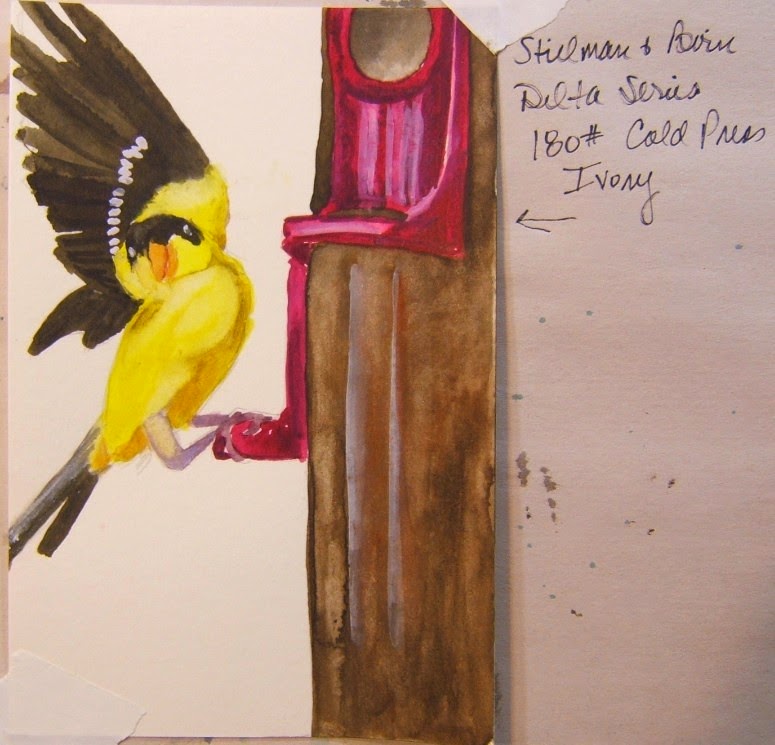
The Delta Series, 180# cold press is in Ivory, so I thought the little yellow finch would like to try this one out with me. Watercolor put down wet-in-dry with touches of gouache for the highlights and wing bars. Then I went back and wet the feeder color, dropping in more colors. Beautiful paper, much like the Beta Series. It's a warm ivory color, so if you like toned paper, you'll like this.
The Zeta Series, 180# smooth paper is also a good paper for water media folks. Nice granulation and blending ability on the paper.
I would say any of the papers are excellent, but for my tastes, the 180# papers are the way to go. Now I guess I'll have to order another journal - or two!
Thanks to the folks at Stillman & Birn for sending me samples to play with and try out!
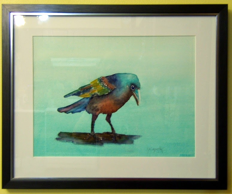
Rainbow Dancer
11 x 15 inches
Arches 140# cold press paper
Sweetie was asked to take photographs at the Greater Cincinnati Watercolor Society show in Mariemont Sunday. We went over around 1:45 and they announced the winners around 2:00 pm. He got photos of the winners with their winning paintings and big smiles and will send them to Deb Ward, who does our blog. Check for the photos and info about the show coming up there later this week. Just go to
http://http://grtrcincyws.blogspot.com to see the photos and read about the winners. (We gave away a First, Second, Third place and three Honorable Mentions. First Place went to a watercolor, Second Place went to an acrylic + watercolor on Yupo, Third Place went to a watercolor on Yupo, and the Honorable Mentions went to an acrylic on canvas, a watercolor + gouache, and an acrylic ink.)
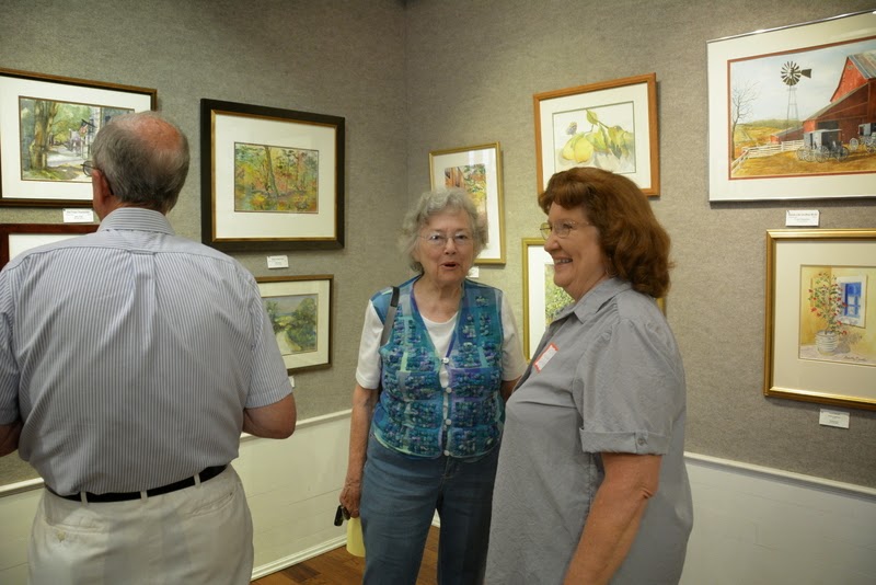
Until then, here is a couple of shots of the crowd. We had A LOT of people come to the opening reception. That is always a good thing. Plus two paintings sold.
People love hanging out around the table filled with food. And I saw quite a few people coming in with bottles of wine.
For photos of the paintings and the winners, go to the GCWS blog later in the week.
And after another GCWS show where I didn't get a ribbon, this post from Dreama Tolle Perry from her webpage, came in handy for me to read! Perhaps you'd like to read it, too? If so...go here.
My problem is, I can't imagine people don't love my crow paintings as much as I love painting them! ha ha
Val Webb asked us to do a few sketches before trying to paint our birds in her online class, Painting Birds in Watercolor and Beyond, this week, focusing on the eyes.
This is a great horned owl, Kentucky (from Jerry's Raptor group). I drew him in graphite on cold press watercolor paper. (Not sure why it looks a bit green as it's on 140# cold press Fabriano, I think.)
The Stillman & Birn sample sheets I was sent are all 4 x 6 inches and I've tried out three of the sample papers so far, using only watercolor and gouache. Here are the results...
The Alpha Series 100# paper held up well to the wet watercolor but really isn't heavy enough to do much in really wet media (you couldn't lift color from the paper well), so I'd use this for gouache or colored pencil, other dry media, maybe.
(Correction: Viktor from Stillman & Birn referred me to the painting by Iain Stewart who is working on a larger sheet of the Alpha paper and he layers up to 5 layers and can lift, using a tough scrubby brush! I stand corrected! Perhaps I was too gentle with my lifting, afraid to tear the paper, or was using staining colors? Thanks for educating me even more about these wonderful papers, Viktor! I have to say, the Stillman & Birn reps are very responsive and I like that.) For that video Viktor sent, see here:
https://www.youtube.com/watch?v=qt-Z1BqZWyk
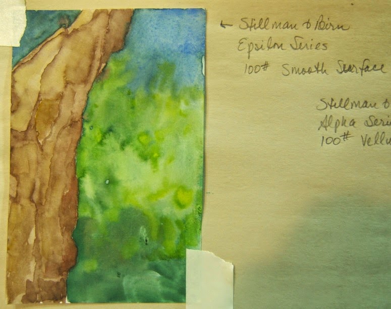
The Epsilon Series 100# paper held up well, too, and was very much like hot press in that it dried quickly and left hard lines which I used to advantage in painting this rough tree. I painted this very wet and the paper didn't buckle or seem to soak up too much water. If you like hot press, you could use this paper the same way, although it is thinner than hot press watercolor paper. This might work best with pen + ink with watercolor.
The Gamma Series 100# paper has a vellum surface and was like hot press paper but you could add and layer color. I didn't lift color, but will try it using a scrubby brush after hearing from Viktor at Stillman & Birn about the Alpha paper liftability.
I added some gouache to the watercolor. Like hot press, you got hard lines when the paper dried quickly, but that could be worked around or used to your advantage.
Of these three papers, I liked the Epsilon Series 100# paper best of all and liked painting wet-in-wet on it and working with the way it dried.
I'll do the other three later...
When the bluejays begin squawking and won't stop (it really gets annoying at times), you know there's a predator nearby and they are sounding the alarm. Well, I looked outside yesterday afternoon and this was in the swimming pool!
We didn't open the pool this year so that's the black cover over the water that he (or she) is standing on and this bird was huge!!! Grabbed the camera and began shooting, moved outside so I could get a clearer shot.
Now that's worth squawking about!
Drove up to Mariemont and dropped off the two paintings I'll have in the Greater Cincinnati Watercolor Society show - which opens this Sunday with an artist reception from 1 - 4 pm at the Women's Art Club "Barn" gallery. Do come to see the show if you're in the area. 6980 Cambridge Avenue, Mariemont (Cincinnati) OH. The show can be seen weekends (August 16, 17, 23, 24) 1-4 pm and weekdays (August 19-22) 9 am - 2 pm. The show runs just one week and weekend from the opening.
The three grandkids and what I came up with.
I need more practice on people! The only one that doesn't look stiff is the one of Jocelyn at the end - colorful but maybe too colorful?
It was Sweetie's idea to take the portraits to show the girls when we were out shopping Sunday and they loved them all. Except Alaina wants some color behind her, more like Jocelyn's portrait.
I'll get in some more practice and try the new ones from freehand drawings - and then present them (or these) to the parents for an extra Christmas present.
I wrote to Stillman & Birn to get some free samples of all of their journal pages and got a really nice email in return that their sample packs were only available from Germany right now, but they would be sent.
And two days later, I got it!!
Here are the paper explanations. I am only interested in the 180# paper for watercolor and watermedia.
From the looks of it, I chose well when I picked a journal last year in the Beta Series. It's 180# and bright white and seems to be between cold press and hot press in the way it reacts to watercolor. I like it, but will try the Zeta Series, too.
I would try the Delta Series, as it's also 180# but it's definitely ivory, not white. The Gamma Series is also ivory but thinner at 100# weight.
And the Alpha and Epsilon Series papers are thin - good for drawing, I imagine, but not for watercolor.
Sometime in the next few weeks, I'll try them all and let you know what I think - and how they performed.
Each sheet in the sample packet is postcard sized = 4" x 6" so large enough to try out.
We drove over to a Cincinnati suburb for the family birthday bash/brunch. My task was making the fruit salad and I might have gone overboard a bit! It was most appreciated, along with the breakfast casserole, coffee cakes and cupcakes for the birthday celebration.
The beautiful flowers were provided for the table by Ginny to brighten the day for A.A., who's suffering with back problems major enough to require a visit to the Cincinnati Spine Institute.
And the birthday girls and boys: four of them celebrating for July and August. It was a spur-of-the-moment photo and, of course, Jerry's camera was in the bag in the other room so I quickly got it, turned it on and snapped a couple of photos - while everyone was breaking up!! Oh, well...
After the get-together, home again, relaxing until we had to change into something different and drive to Aurora, Indiana for the Southeastern Indiana Artist Guild show. We got there about 15 minutes before the award ceremony, so got to walk around and see all the paintings. There were 57 paintings in the show, varying from Watercolor, Water Media, Mixed Media, Acrylic, Oil, to PastelCharcoal, Colored Pencil, and Photography. In order to encourage kids in art, they even had a special section for childrens' art and they received awards, too.
My painting, The Littlest Bird Sings the Prettiest Song, was mistitled on the handout and on the title card next to the painting. I figured it would be. Guess I should have just called it The Littlest Bird because that would have made more sense than what they had: The Littlest Bird Sings the Song. Oh, well...
I did win an award - which I think is what an Honorable Mention would be in any other show but the SIAG has odd-named awards like Memorial Award and Award of Distinction in xxx, etc. Anyway, I won Award of Distinction in Watercolor and got a nice check, too.
They had announced all of the awards in Watercolor and Water Media (or so I thought), and I was just about ready to leave when they said my name, so it was a surprise for me. I am glad I got an award, because I think it is a good painting and different enough to show artistic thought. Sweetie said, "Your painting could be seen well across the room because of the values and color."
Thanks, SIAG!! I think Sweetie is planning to compete in the Photography section next year :)
And after seeing the photos of myself, I really really really need to lose ten pounds and do something with my hair!!! I did have on my lucky Carol Carter scarf, though, and I think that made all the difference! ha ha I was carrying my Ravens tote from Flashbags. com, too :) It was made from a painted collage by Elizabeth St. Hilaire Nelson of Florida. They made it special for me because they didn't have a run of these - and they are very reasonable in price and I've gotten a lot of compliments (and looks) when I carry it.
Sunday, as part of the grandgirls' birthday presents, we drove them up to Monroe, Ohio to the North Face Outlet for some back-to-school things. Spent a long long time in that store, only to find nothing so began the long walk into each possible store without luck. I was getting discouraged when we were told about a Columbia store in the same outdoor mall - went there and both girls picked jackets almost immediately. YAY! Success! And because the Columbia fleece jackets were less than 1/2 what the North Face jackets were, they were allowed to get a few extra things - mostly tops to wear layered from Aeropostale (a store where I could not have fitted into anything).
Diet begins Monday!
Another crow with drizzles and drips.
This one has a pale grey background but it's pretty light.
This goldfinch was fighting for his right to stay on the feeder - another goldfinch was challenging him but he was just a blur in the photo so I cut him out (on the right side). I liked how the wing was up and he was holding on to the feeder post with all his might. (I was surprised at how grey his open wing was - no color on it at all.)
Now that we have 2 feeders, we have plenty for everyone with 10 posts. We have A LOT of females but only 2 males.
My friend, Deb Ward, and I had a nice outing Wednesday, driving to Commiskey, Indiana, to the Stream Cliff Herb Farm. We walked around, looking at the flowers and herbs and taking photos - and then had a scrumptuous lunch at the tea room. I had dill and rosemary chicken salad on greens and Deb had the mozzarella and tomato salad, leaving room for the light and lovely lemon cake which Deb let me taste - yum!!
Here are some photos from the day...

Indiana's oldest herb farm, this house is still occupied by the present owner, Elizabeth Manning. The family has lived and worked at the farm for five generations.
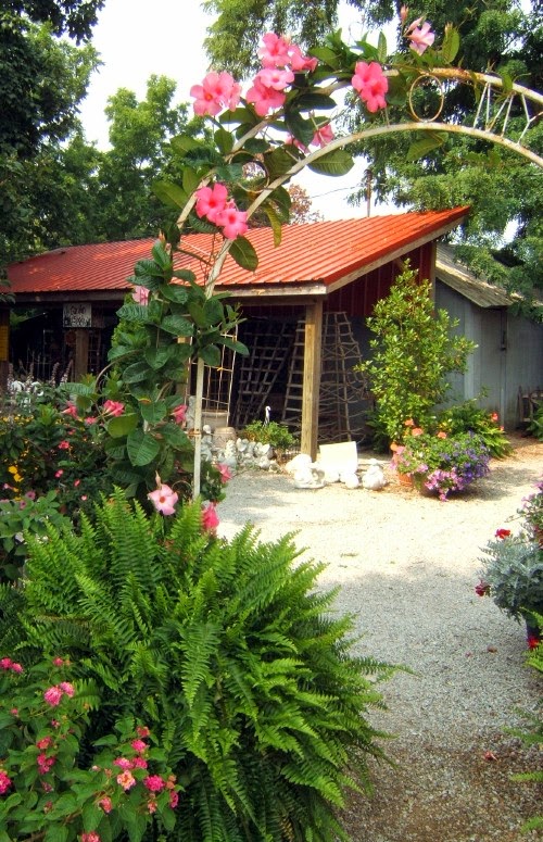 A lot of little paths and arches draped with blooming flowers.
A sunny garden, blooming flowers everywhere, and a shaded table. What could be better?
A lot of little paths and arches draped with blooming flowers.
A sunny garden, blooming flowers everywhere, and a shaded table. What could be better?
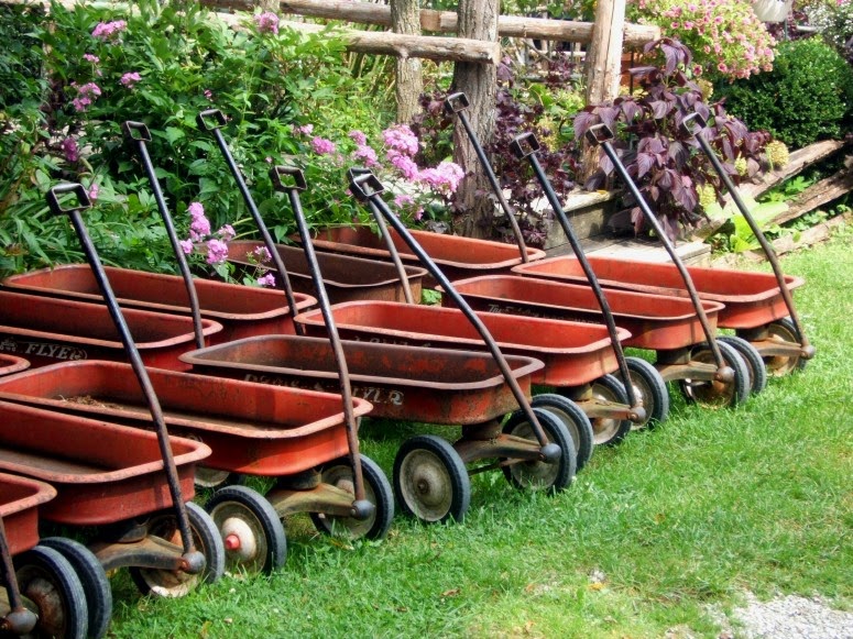
Plenty of little red wagons to take the purchases to the car and many flowers and herbs for sale.
Bowman's Framing did another great job on the matting and framing of my Colorful Crow painting. (Sorry for the glare - it's hanging on my kitchen wall right now.)
This one, plus the Over the Edge painting posted earlier, will be seen in the upcoming Greater Cincinnati Watercolor Society show.
When?
Opening reception, Sunday, August 17 from 1 pm - 4 pm. Show runs from Saturday, August 16 through Sunday, August 24 (open 1 pm - 4 pm on weekends and from 10 am - 2 pm Tuesdays-Fridays).
Where?
Woman's Art Club of Cincinnati (WACC)
The Barn gallery at 6980 Cambridge Avenue (Mariemont), Cincinnati, OH
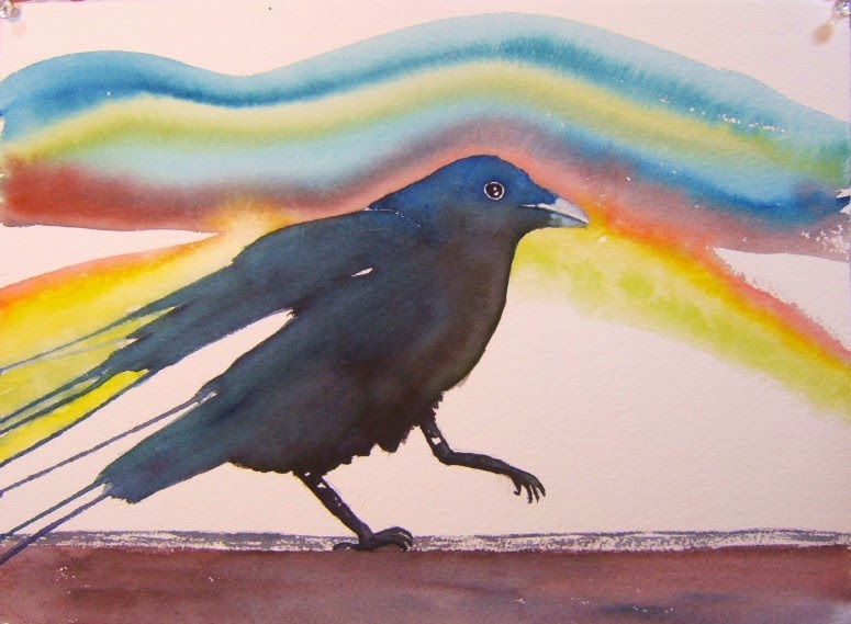
You know I love crows - and drizzles. I started with blowing the color outward in the direction of the wings and tail (like Val Webb shows on her blog. I wasn't thrilled with the outcome, whether I blew across the paper or used a straw, so I just tilted the paper, dropping water at the top of the pigment (with a brush full of clean water) and let it flow out out out. I'm liking this one and can see doing others using this technique.
Wind Dancer
On 11 x 15 inches Arches 300# hot press paper
A non-typical Leo, the world does not have to revolve around him. Sweet as candy, which is why I call him my Sweetie :)
No birthday cake because there are just the two of us and who wants to eat birthday cake all week (I admit, cake is not my favorite thing).
So...
I stopped at our local famous pastry shop, Servatii's - they make heavenly things in there - and picked up this:
It's called a Chocolate Dome Sensation.
Since I had to taste test it before giving it to Sweetie, I can tell you that it's filled with a chocolate pudding-like filling and the bottom is a crunchy chocolate bar - the topping is chocolate ganache with a white swirl with decorative white chocolate pieces on top. Lovely to look at on it's gold "plate" and delicious!!! More like pie than cake inside - creamy and rich (so rich, I only ate half of mine during the taste test!!).
Sweetie has more willpower than I, so he has not even tasted his Choco-Dome Sen (Sin?) yet but I imagine he'll tear into it today after lunch. I bought him another sweet called a Cloud 9 and it looks chocolately delicious, too (maybe he'll share with me?).
This weekend, everyone in the Southeastern Indiana Art Guild show drops off their painting(s) for the show beginning with an artist reception Saturday, August 9 from
6 pm - 8 pm. The show runs through August 16th and can be seen at the SIAG building at 305 2nd Street, Aurora, Indiana. I put one painting in the show - The Littlest Bird Sings the Prettiest Song.
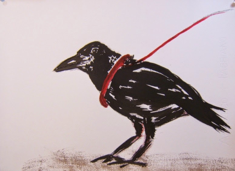
Painted with black India ink and red watercolor. This crow sits in my art room so I guess she's an assistant and model, too :) Not real, but a gift to myself. I've been given 2 other crow models from friends in the past so have 3 models I should use more often!
Don't Pet a Crow
11 x 15 inches on Fabriano 140# cold press paper
Still slowly working on the portraits of the grands...I have a deadline (will I make it?).