Saturday, January 31, 2015

ABSTRACT WITH BLUE BEGINNINGS


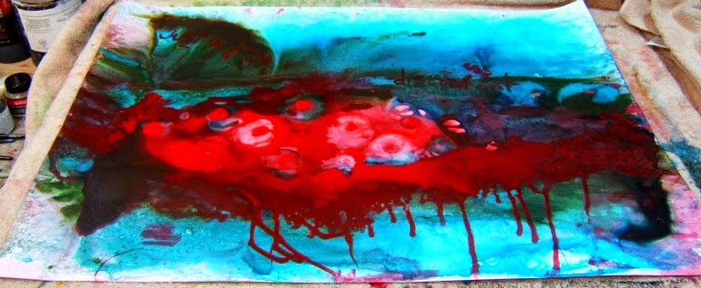
I'm going to try my hand at another abstract, this time with my favorite blue color underneath.  I started this one on a fourth sheet of Fabriano Artistico 140# cold press which had a "failed" painting of a flower on it.  As you can see, the blue acrylic paint is very transparent.  


You can see the flower underneath (which I'm going to allow and see what happens).

The color - a Golden acrylic in Manganese Blue Hue (a small jar given to me in a goodie bag of Golden products when Merle Rosen (a Cincinnati artist and Golden rep.) gave a talk and demo to the watercolor society last year (or year before).  


Once this layer dries, I will put down two layers of greyed white acrylic over it and let that dry.  


Then the scraping into the paint to show the blue color underneath begins...this will be done just like I did Bird's Nest Soup a few postings ago.


Thursday, January 29, 2015

TUESDAY CLASS


Since I had received three bouquets, I separated them into more manageable sets for my two students to paint.  I was surprised there was NO whining about painting from a still life set up in front of them.  (I've been in classes and workshops where there was a lot of whining about painting a still life set up of flowers.)  


This is the set up Joy tried.  I sent her a photo to use at home and finish (or not). 


This is the set up Linda tried.  She also got a photo of her own to try to finish or work on at home.  


I have to give kudos to both students for being good sports, for understanding that this was a lesson in painting what you see (rather than what you think you see).  


And I couldn't make them work so hard without doing it myself, so I had a set up of my own to try and paint of the white flowers.  I removed the daisies from this, moved the flowers around, and painted this while it sat in front of me on the table.  The trick was to get all those white flowers!!


It's not finished (need the vase to be much darker blue and to have a shadow to ground it on the table), but I'm not unhappy about the white flowers at all.


Our goal was to see it and paint it correctly without getting overly fussy.  


Tuesday, January 27, 2015

MORE FLOWERS? !?


I received three bouquets of flowers (some for get-well wishes and one for my birthday).  Thought I'd share.  Flowers are so lovely.  I know I always say I don't care whether I get them, or not, but getting three bouquets had me smiling - and they smell so nice.


Enough bright and pretty flowers to make anyone smile!


My sister's flowers minus the hydrangea and the purple dried "filler" flowers.  The roses in this smell wonderful!


Monday, January 26, 2015

FLOWERS - GET WELL AND HAPPY BIRTHDAY GREETINGS


These flowers, from my sister and brother-in-law, are a get well bouquet, but I'm claiming them as a birthday bouquet, too.  Why?  Well because today is my birthday.  I've already eaten a red velvet cake iced brownie to celebrate and there will probably be more sweets to come later :)


But until I have something to share from drawing or painting, I'll share the flowers with you - you may be inspired to draw or paint them.


I may have my students give it a try tomorrow in class - drawing and painting whites can be challenging.

Of course, I should do it, too!  But sweets are calling my name today for some reason...and I've been told I can eat whatever I want today because it's my birthday! ha ha


This morning, there was a hawk (I think a Cooper's Hawk) on the railing of the deck.  It looked at me as I looked at it through the kitchen window.  The birds had gotten the word and were no where to be seen, but the hawk was around a while, waiting.  Only a silly or brave squirrel was foolish enough to come to the feeder while the hawk was sitting on the deck railing - maybe it was too big for the hawk to try it because it just flew to a lower railing on the deck and then off into the trees. 


I got a lot of get well cards today and appreciate them so much.  I am healing well and trying not to overdo it with lifting and moving around a lot.  I also got 3 e-cards for my birthday :)

We have a light dusting of snow on the ground this morning.  But the folks in the northeast US are going to get hit with Winter Storm Juno today, a blizzard of historical proportions.  So let's send out a wish and a prayer that everyone stays safe and warm and is very careful out there (if they have to be out).   I remember a January 26th blizzard we had where nothing happened all day and I walked in snow up to my hips to my grandmothers house from my aunts house (just 2 houses down) because I couldn't just sit inside and not see anyone or talk to anyone on my  birthday.  I felt pretty sorry for myself that day but I remember it more than other birthdays that have come and gone.  

What about you?  Have you had any big birthday events that created memories for you?  If not, then make plans to go out and create something big on your next birthday!  Why not?  What's stopping you?  

Sunday, January 25, 2015

AND BACK TO LARGE DRAWING


If you remember, I started a large graphite and charcoal drawing of some specimens my Sweetie collected (they are Scanning Electron Microscope images of a critter - a brittle star - called Ophiocomella sexradiata but I'm just calling her O Sexy :)  


The brittle star is a pretty thing, long legged with legs (or is that arms) that look tattooed with color.  I am going to do the 4 block around the edges with graphite and charcoal and the middle as she is in real life, in color.  


These photos give you an idea of where I am (finished the two lefthand blocks) and where I'm going next (the middle brittle star in color).  

Time to get out the watercolor pencils for the color.


I am in the healing process after a "minor" surgery on Friday the 23rd.  (Surgery never seems "minor" when it's your body and I was very afraid and anxious about it because I've never had anything surgical done other than a biopsy decades ago.)

I 'll be fine and will take care of myself, being careful not to overdo it.  A good time to draw or paint or see art on blogs or watch t.v. or read or...you get the idea :)  


Here is a bad photo of the flowers my sister and brother-in-law sent.  The vase was supposed to be cobalt blue and it is - but you can only see that when you hold it up to the light.  It's dark and frosted, I think, but it's blue.  The hydrangea is pale blue.  There are white lilies and white roses in there, too = pretty and smells great!


Friday, January 23, 2015

BACK TO THE BIRDS


Revised this little Carolina Wren in my sketchbook.  He (or she) has been showing up at the suet feeder, round little golden brown thing, hopping around, with a tail like an arrow pointing to the sky - so cute!

I may have to paint her.  


And back to The Laws Guide to Drawing Birds, I copied one of the wing illustrations in the book.  In this section of the book, he's talking about how the wing feathers attach to the underlying bones.  Not something I'll remember, but it does help to see what feathers are on the wing and where when you're drawing.  

Have a good weekend!


Wednesday, January 21, 2015

ACRYLIC ON PAPER - ADDING AND SUBTRACTING TWO


I didn't photograph each step of this one, but continued it a la Jane Davies video, and tried to get something pleasing.  Just playing with abstraction with a lot of adding and subtracting of paint until it looked finished.  


On a half sheet of Arches 140# coldpress watercolor paper.


Bird's Nest Soup


Thanks, Jane, for the informative videos you share and for your blog!  I'm not an acrylic painter or an abstract painter, but abstraction appeals to me and I'm testing the waters...

Monday, January 19, 2015

ACRYLIC ON PAPER - ADDING AND SUBTRACTING ONE

Over at Jane Davies blog, she shared a video on January 10th of her layering acrylics and scraping into, adding and substracting as she goes to finally come up with a very interesting abstract.  Go over and see how it's done.  


This is just my tiny effort at trying it out and seeing what it becomes.


First, red (and the red is a cooler red than it shows here - my camera will not get the right red on this - which is alizarin crimson).  

After this dried, I covered the paper with white acrylic and let that dry, adding another layer of white acrylic on top of the first layer.  Jane greyed her white but I put mine on right out of the tube.


When this dries, you scrape into it with something sharp to excise some lines.


This is your true starting point.  From here, you add color, substract, scrape, wipe and blur color, keeping a muted palette for the painting.


Jane used a lot of white, black and quinacridone gold acrylic paint to come up with a really nice abstract.  

Saturday, January 17, 2015

JUST A LITTLE DISCOMFORT


This painting, a response to a terribly painful medical procedure I had to endure in December, is titled 


Just a Little Discomfort  

(which is what the medical people in charge told me I would experience)


TerraSkin is made from stone (actually, it is made from more than 75% calcium carbonate added to less than 25% polyethylene used as a binder).

This sheet was heavy (the sheets come in various weights from 8 to 16 pt. - not weighted like watercolor paper but the online information tells you what the weight is compared to watercolor paper).  The "paper" was given to me by a watercolor society friend who said she probably would never use it.  

As this picture shows, it wasn't a very good abstract to begin with; and I thought more effort and thinking about it - as well as bringing out what I saw in the original painting - would make it better.  

The shine of the acrylic on the TerraSkin made it impossible to photograph while on the wall so it's lying on the table and the colors here are pretty close to what they are in real life.

(Art isn't always beautiful.  Sometimes it's cathartic, meant to release your inner feelings which are not always pretty.  And sometimes people recognize the humanity behind that - sometimes they don't.)


I worked on this again, lifting paint off with alcohol sheets and shaping things more for visual interest.  I even cropped a bit off one edge and the top so it's more horizontal now.  Here's the revised version, which makes more sense to me - and, I hope, to you!


I was able to put it on the corkboard and photograph it but the left side is still shiny so here it is on the table (without the shine on the left side).


Thursday, January 15, 2015

ABSTRACTED FLOWER ON GESSOED PAPER


I did this in class Tuesday morning while my students were drawing out their work to paint on gessoed paper.  Just playing with colors and it seemed to become flowers...


Tuesday, January 13, 2015

ABSOLUTE ELSEWHERE

Well, I read something this week that talked about absolute elsewhere - it's a physics or maybe astrophysics idea.  And those words stuck with me.  Sometimes this is where you want to be:  the absolute elsewhere.


So that's where this came from - just those words and the idea of space time.  


Watercolor on a fourth sheet (11 x 15 inches) of Arches 140# cold pressed paper after I had put down a layer of white gesso and let that dry.  So easy to lift off color as long as it isn't staining.  

I think I need to give the two moons (or planets) a bit more interest because they look pretty flat here compared to the center moon or planet.  


My watercolor class today will be painting on gessoed paper.  You can create some amazing texture using gesso over watercolor paper.

Monday, January 12, 2015

GOLDEN ACRYLIC MICACEOUS IRON OXIDE

More information on the Micaceous Iron Oxide (from the Dick Blick wepage - the
only place, besides Amazon, where I could buy this).


Golden Special Iridescent Acrylics:

Use these special iridescent colors to add a sparkly touch or a distinct texture!

These extraordinary colors are created by mixing assorted mica partials with gel medium. The Micaceous Iron Oxide, with its rich simmer color and gritty surface, makes a glorious ground for pastels.

Palette knife application is recommended.


Special Iridescent Acrylics — 

Mica Flakes, 
Coarse Alumina and 
Micaceous Iron Oxide: These special iridescent colors to add a sparkly touch or a distinct texture! These extraordinary colors are created by mixing assorted mica partials with gel medium. The Micaceous Iron Oxide, with its rich simmer color and gritty surface, makes a glorious ground for pastels. Palette knife application is recommended.


Until I play with this more, I can't add anything to this description, but if you're interested, just buy a small container and try it!  


It is thick so you thin it with acrylic mediums or water and have fun!  


Sunday, January 11, 2015

MICACEOUS IRON OXIDE


A few year's ago, I took a workshop with Myrna Wacknov at Kanuga in North Carolina.  It was great fun and she shared so much information.  One thing I really liked and intended to use was a Golden product called Micaceous Iron Oxide.  It's taken me this long to get around to buying some and then longer before I finally opened it and used it.


Of course, it lends itself to crows!


I painted the crow with the Micaceous Iron Oxide over the painted background of acrylic inks so the painting is all acrylic.  The Micaceous Iron Oxide is a gritty product and you can lay it on thick or thin.  I think I'll play with it again soon...


Detail of the crow.


You never know when something you learn in a workshop turns up in your own work later - sometimes months or even years later.  But you keep the information in your head until it's time.  Thanks, Myrna!

Saturday, January 10, 2015

THE PLUS TO HAVING BITTERLY COLD DAYS


It sometimes means that you have gorgeous flaming sunsets like this.

Friday, January 9, 2015

UPDATED BIG BLUE FLOWER


This one sat around for a while, lacking something.  I finally decided to add orange to the center stamens (which look a bit brown since the orange was painted over blue).  Softened a bit and darkened a bit and I think it's done.


Into the Center
Full sheet 22 x 30 inches.

Wednesday, January 7, 2015

FINISHED PRAYER FLAG PAINTING


Finished this one by just writing on the flags with white acrylic ink pens.  


On half sheet Arches 140# cold press paper but length-wise, 11 x 30 inches.

Monday, January 5, 2015

PRAYER FLAG INFORMATION IN SHORT

Prayer flags originated in Tibet with the Bon religion (the original Tibetan religion based on animistic and shamanistic beliefs before Buddhism was introduced in the 7th century AD).  Prayer flags are made and printed with special prayers, then hung outside for the wind to take the prayers far and wide.

Tibetan prayer flags are usually in sets of 5 and come in these colors with these meanings to represent the 5 elements:

Earth = Gold/Yellow
Water = Green
Fire = Red
Air/Cloud = White
Sky/Space = Blue

The prayer flags usually have various pictures of Buddhist religious items on the flags, or they can just have Tibetan words/prayers on them.  If you do a search of Tibetan Prayer Flags, you will find many images of thousands of prayer flags stretching out over mountaintops, some so ragged, they are barely cloth anymore - just think of how many years those prayers have been winding their way around Tibet! 

That doesn't mean that any group or religion cannot incorporate prayer flags.  I've seen them (online) being done in children's art groups or women's healing groups.  I wouldn't do them just as an art project without the prayerful intent behind them being shared, but they could be a powerful art project for people needing healing or strength or help for the usual human fears we have.

Here is a link to a site that tells more about this and how you can use prayer flags, creating them for yourself or others...


Saturday, January 3, 2015

FIRST 2015 PAINTING: PRAYER FLAGS


For a while, I've thought about creating something using my prayer flags.  I sketched out a simple idea and then didn't paint it.  I did cover some watercolor paper with gesso to prepare for a class lesson so gessoed a long piece of paper (full sheet torn to be wide and long).


Now, for the first time in a month or more, I've picked up a brush and started something.  I wanted the prayer flags to look tattered at the bottom, like they've been out in the wind and rain (using my own as models pinned to the top of the cork board).

This is a work in progress.  


I am not sure I'll lift the prayer words or use white ink to write them...


Thursday, January 1, 2015

HAPPY 2015

Happy New Year to all! 
Wishing for good things 
to come your way in 2015.  


Although I haven't been creating much (health issues taking my mind off anything else right now) - other than a few doodles and sketches (not really worth sharing), I am reading blogs.  And I hope 2015 brings you many wonderfully creative ideas to fill your sketchbooks, canvases, and papers.

But if 2015 brings you bad news (because it, too, is part of the human experience), try to remember that FEAR stands for False Evidence Appearing Real.  The things that cause you worry and fear may not even be real, but just a construction in your mind.  

Be well, 
be happy, 
be creative, my friends!  
And now let's really get into 2015!